Graphic and Web Design

Balmain Hair Couture Turkey

Upon being assigned as the Art Director of Balmain Hair Turkey, I successfully designed and developed the Balmain Hair Turkey website entirely on my own, completing the project in just three days using Shopify—a platform I had never used before. 

The project came with a tight deadline and strict corporate guidelines, requiring the website to be almost identical to the main Balmain Hair website, while also catering to the local market. The challenge was immense, as I had to master Shopify’s tools quickly, ensuring that every detail—from the luxurious visuals to the seamless user flow—reflected the sophistication of the Balmain brand. Despite these obstacles, I managed to deliver a high-quality, fully functional e-commerce platform that not only aligns with the brand’s global image but also provides an excellent user experience for local visitors. 

This project showcased my ability to handle complex tasks under tight deadlines, master new tools swiftly, and uphold high design standards. The result is a polished website that effectively communicates the elegance and exclusivity of Balmain Hair, while offering a smooth, engaging interface.

Cosrx Social Media

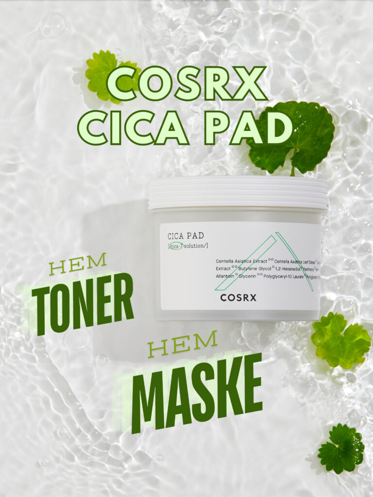
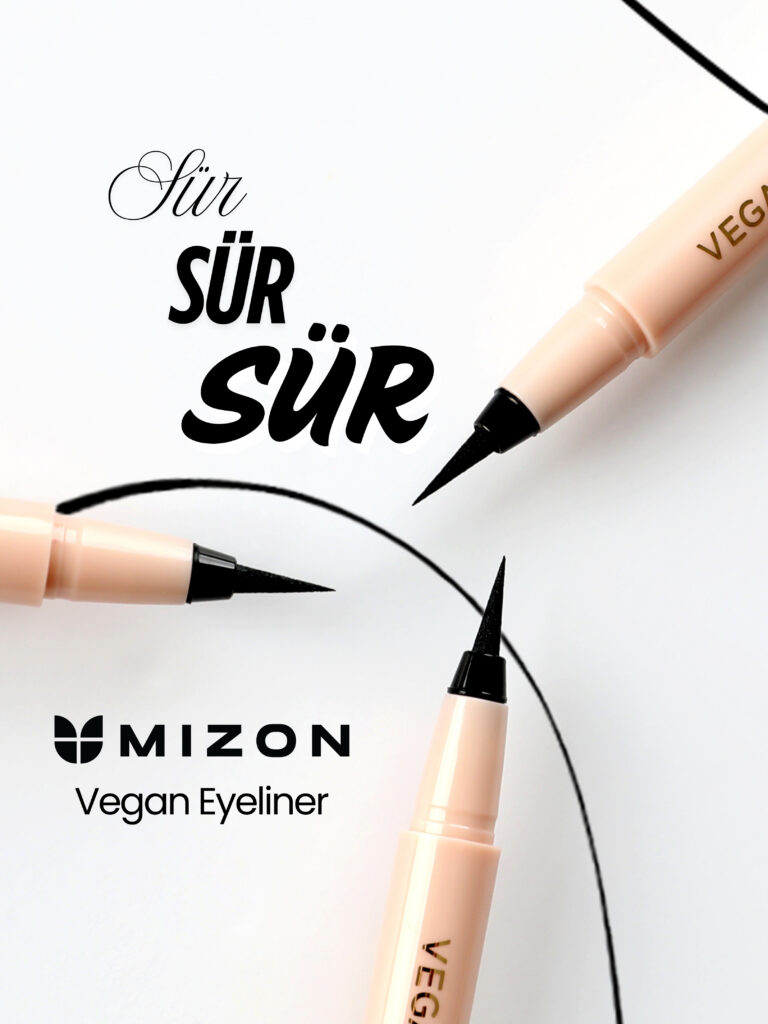
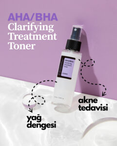
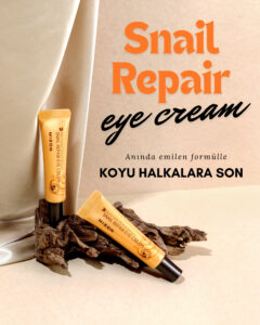
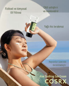
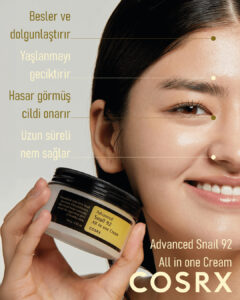
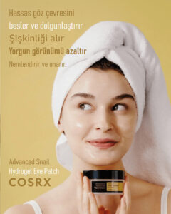
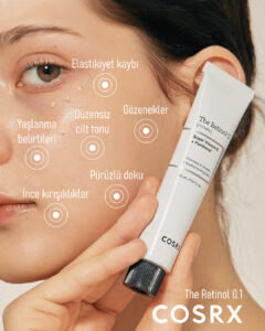
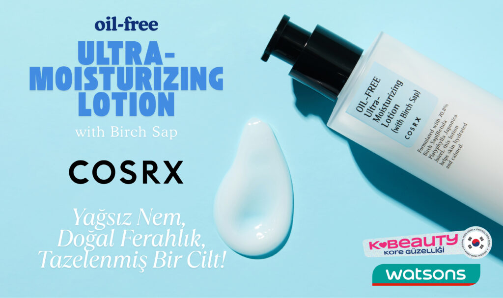
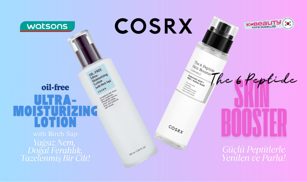
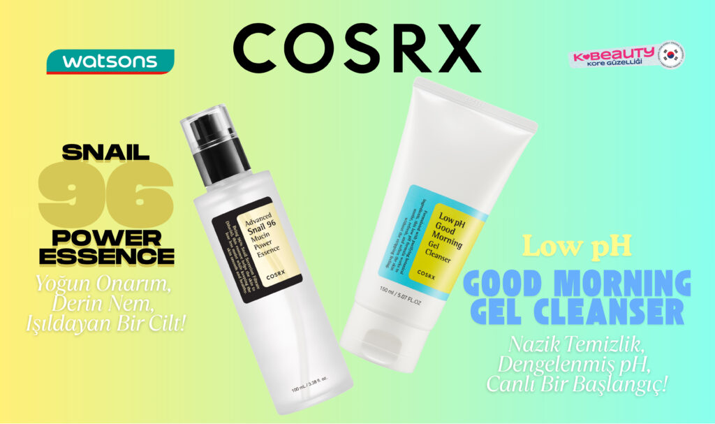
I developed a series of visually appealing social media post designs for COSRX, ensuring each piece is compliant with the brand’s guidelines while elegantly highlighting the unique properties of their products. Every design is meticulously crafted to radiate positive skin vibes, aligning perfectly with COSRX’s mission of promoting healthy, radiant skin for all.

By utilizing clean aesthetics and vibrant imagery, these posts not only emphasize the efficacy and benefits of each product but also create an inviting atmosphere that resonates with the audience. The designs leverage engaging graphics and thoughtful messaging to foster a sense of community among skincare enthusiasts, encouraging them to embrace their skin journey with confidence and joy.

Each post is strategically developed to capture attention in a crowded digital landscape, enhancing brand awareness and driving engagement. This approach not only showcases COSRX’s innovative skincare solutions but also builds a narrative that encourages conversations around self-care and skin positivity. Through these designs, I aim to contribute to a strong and engaging social media presence for COSRX, inviting followers to explore their products and celebrate the beauty of their skin.

E-commerce

In my e-commerce visual designs, I craftfully bring together various elements to create coherent environments that showcase products in a visually appealing manner. By thoughtfully arranging sets of products, I aim to induce a desire to purchase, making each item not just a product but a must-have experience.

Using Photoshop and Illustrator, I manipulate images to fashion compelling visuals that highlight the unique features and benefits of each product. My design process involves a keen eye for detail and an understanding of how color, composition, and context can influence consumer behavior.
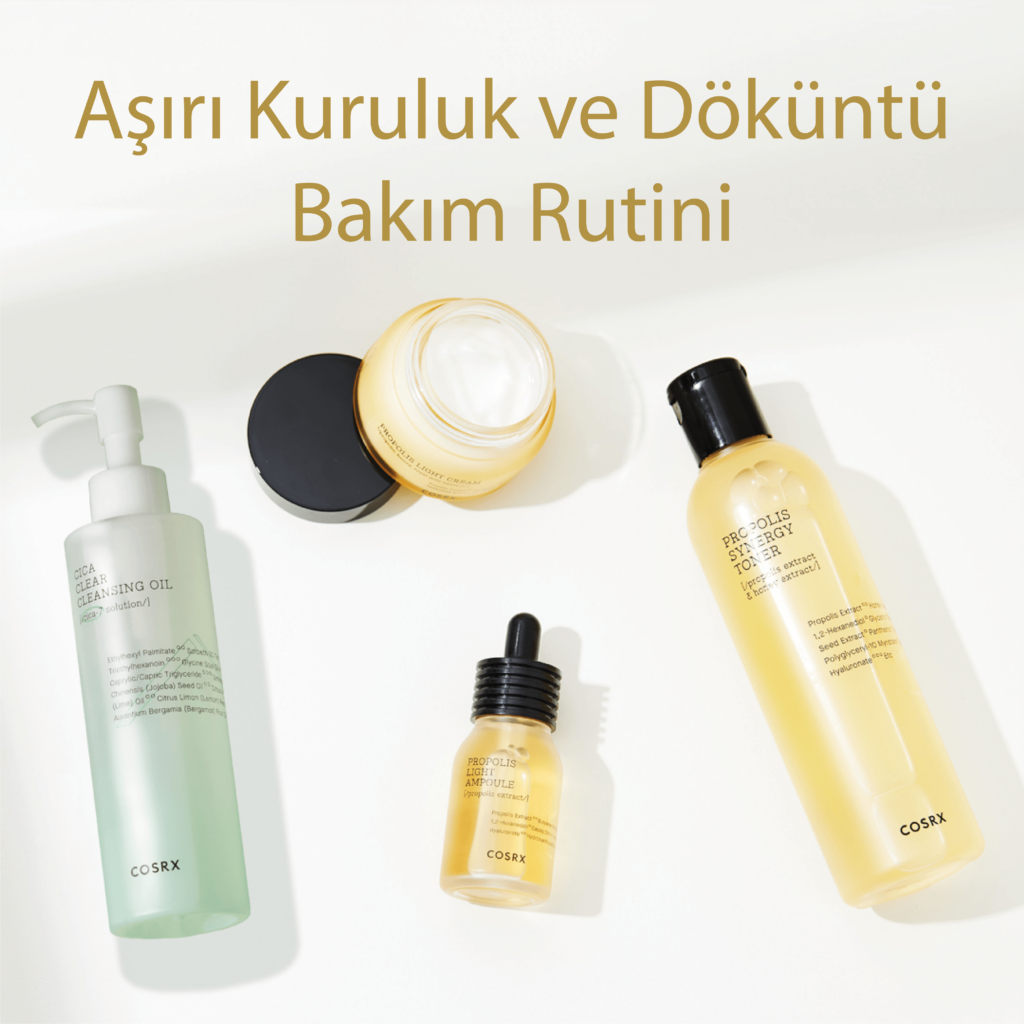
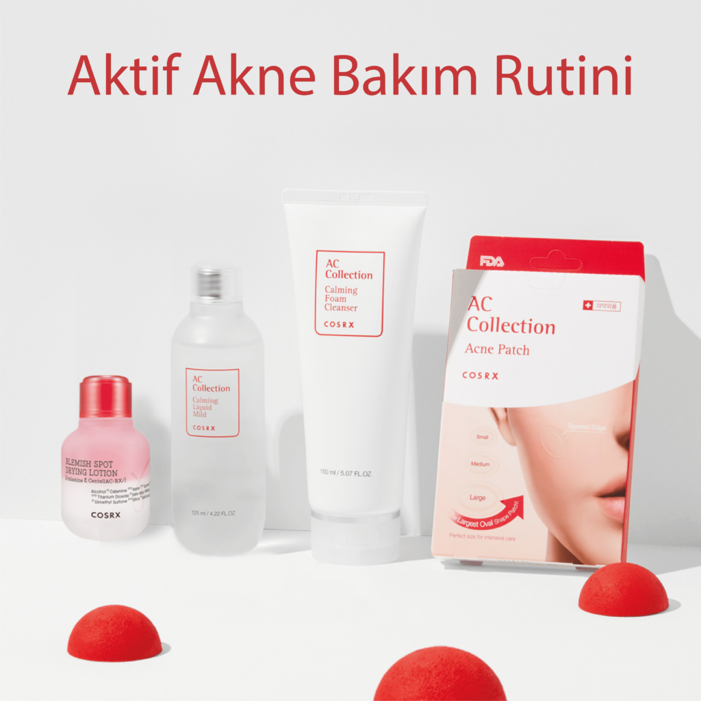
Each visual is tailored to reflect the brand’s identity while engaging potential customers and driving conversions. Through creative storytelling and striking imagery, I strive to create a captivating shopping experience that resonates with the target audience, ultimately enhancing their connection to the brand and increasing sales.

Balmain Hair Social Media

I had the opportunity to create a series of striking social media post designs for Balmain, aimed at capturing the brand’s luxurious essence and engaging its audience. Each design was crafted to reflect Balmain’s unique aesthetic, blending bold visuals with elegant typography that resonates with the brand’s identity.

The posts were strategically developed to promote product launches, highlight seasonal collections, and enhance brand awareness, ensuring they stand out in a crowded digital landscape. By utilizing high-quality imagery and cohesive branding elements, I aimed to create an enticing visual narrative that not only showcases Balmain’s offerings but also fosters a deeper connection with its audience.

These designs contribute to a strong social media presence that aligns with Balmain’s luxury image, inviting followers to experience the elegance and innovation the brand represents.

Distribution Group Website Restoration

I completed the restoration of the Distribution Group website, distributiongroup.com.tr, updating its features and improving functionality to align with the company’s premium brand identity. Using high-quality visuals from their partner brands, I restructured the site for better navigation and user experience, while ensuring compliance with corporate guidelines. 

This project involved a careful balance of aesthetic appeal and usability, resulting in a site that is both visually stunning and easy to navigate. The result is a modern, professional website that showcases the company’s luxury offerings and provides an enhanced digital presence for clients and business partners. Ultimately, this restoration not only revitalizes the brand’s online image but also sets the stage for future growth and engagement.

Single Covers

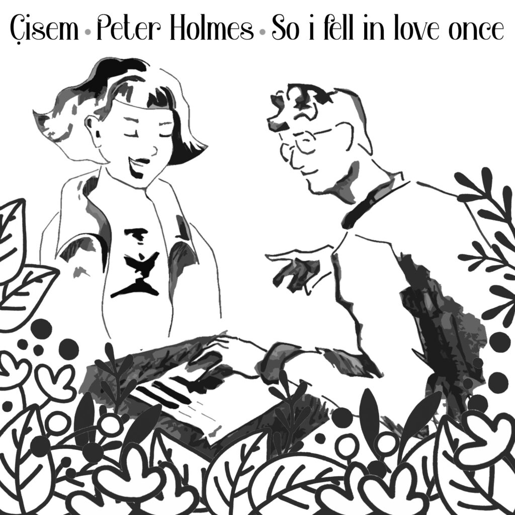
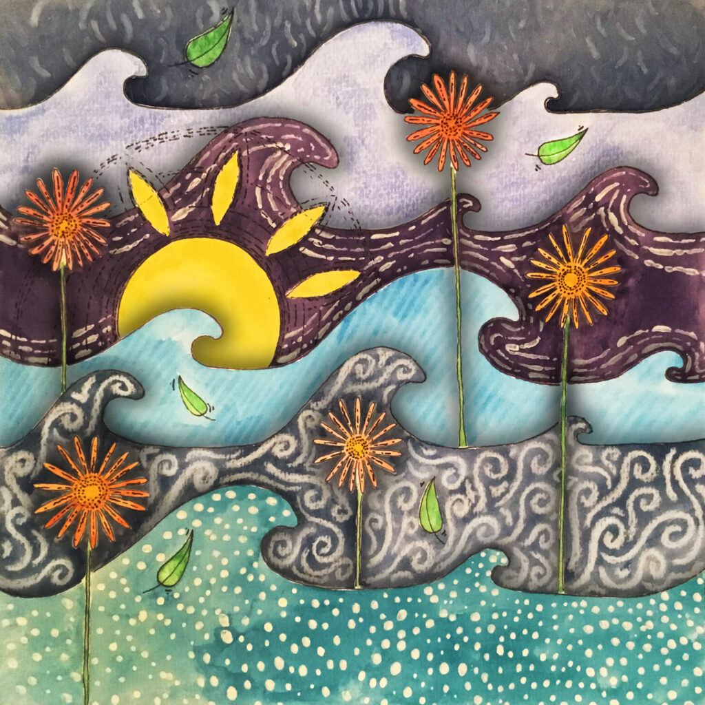
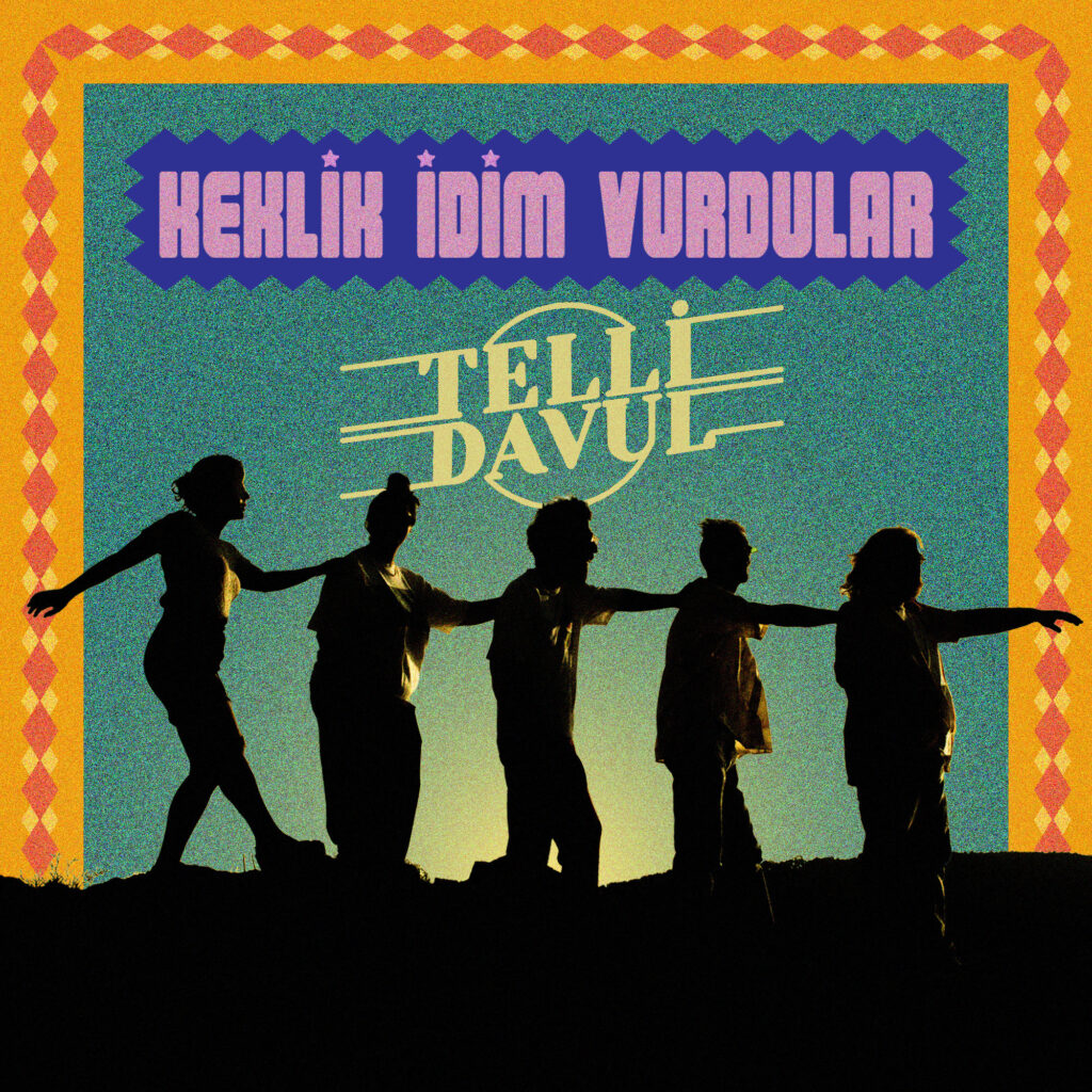
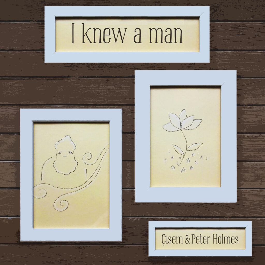
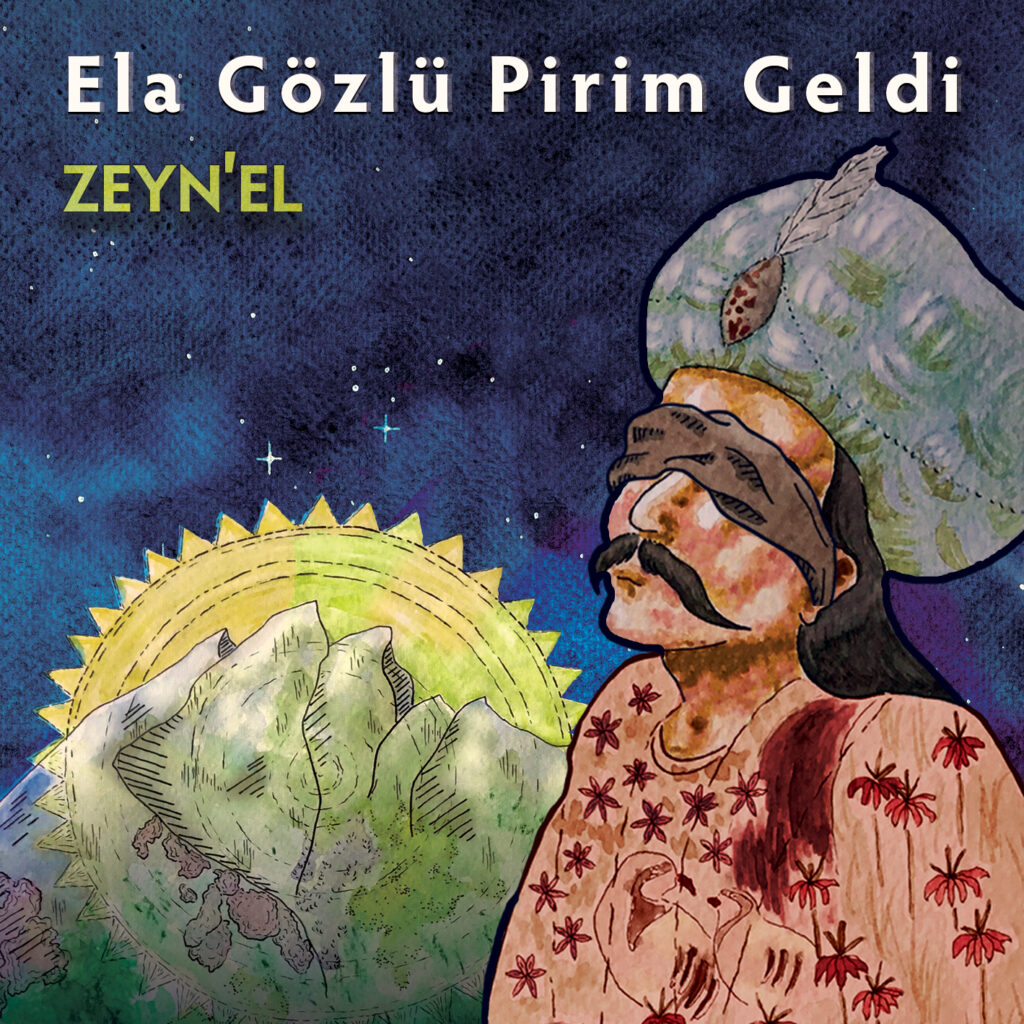
I specialize in designing single covers for musicians across various genres. Using a blend of traditional and digital methods, I create unique artworks tailored to each artist’s style. Some covers feature traditional mediums like watercolor and oil paintings, which I then digitize for a polished finish. Others are crafted entirely digitally from scratch, ensuring each design meets the specific artistic vision and genre requirements. I carefully select fonts that complement the genre and enhance the overall visual impact of the cover artwork.

So far, I have created six single covers spanning genres like jazz, folk, electronic, and funk for musicians such as Deniz Mahir Kartal, Zeyn’el, Telli Davul, and others. Many of these designs involved digitizing hand-made oil, watercolor, acrylic, or mixed media paintings, which were then refined using programs like Photoshop and Illustrator.
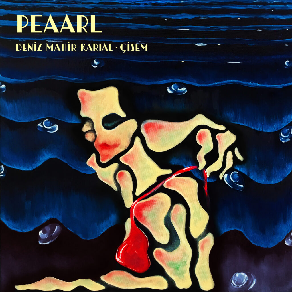
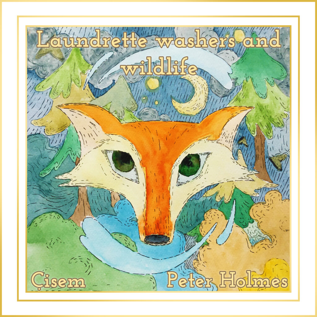
Each process was executed with great sensitivity to the musicians’ requirements, platform specifications, and audience expectations. Ensuring each cover was unique, captivating, and legible was paramount.

Album Artwork

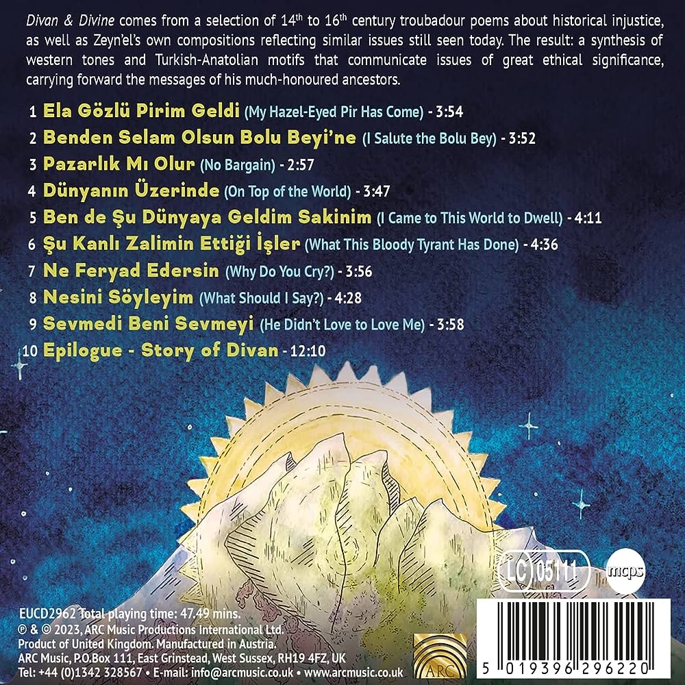
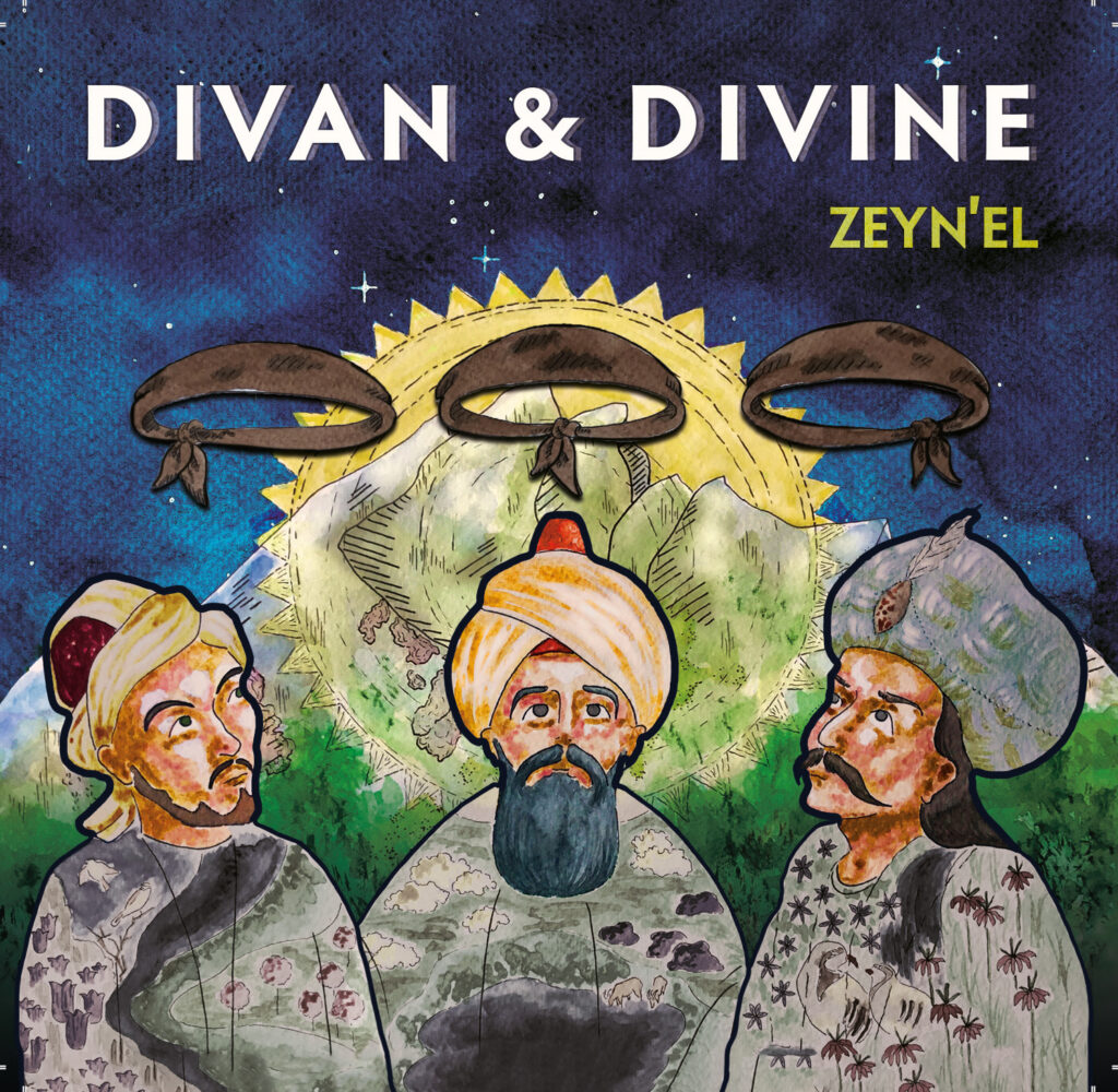
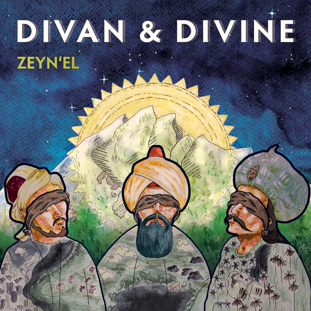
Zeynel’s album ‘Divan and Divine’ is a compilation of traditional Turkish folk songs, with a prominent focus on justice. The songs feature works by three esteemed Turkish poets: Pir Sultan Abdal, Nesimi, and Şah Hatayi. For the album’s visual design, I placed their portraits against the backdrop of Turkey’s Munzur Mountain. The sun, adorned with 40 spikes—a nod to Alevi tradition—shines brightly behind them. Initially depicted with blindfolds to symbolize impartiality, their torsos reflect the Anatolian landscape. 

As the album unfolds, the blindfolds are gradually lifted, symbolizing their awakening to the injustices of the world. This versatile design was crafted to adapt seamlessly across various applications. Notably, Şah Hatayi’s portrait against the same backdrop was also featured in one of the album’s single releases. The design aimed to evoke both the timeless spirit of Turkish poetry and the contemporary relevance of its social themes, resonating with audiences beyond cultural boundaries. The album was released by ARC Music, and their design team was actively involved throughout the entire process, which was incredibly enriching.
Event Artwork

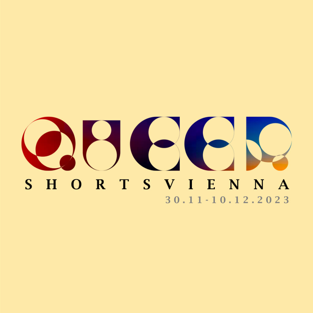
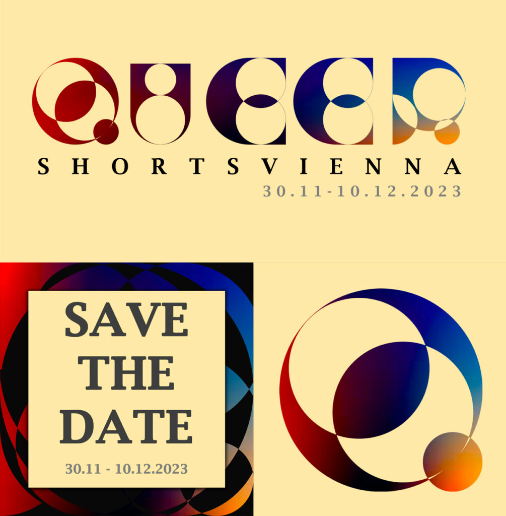
For Queer Shorts Vienna, I undertook a comprehensive design approach, starting with creating a bespoke font to establish their corporate identity. This font was applied across various materials including banners, social media posts, posters, and stickers. The design concept aimed to embody the inclusivity and interconnectedness within the queer community, emphasizing overlapping shapes and vibrant colors. Each element was carefully crafted to reflect the event’s celebration of diversity and unity.

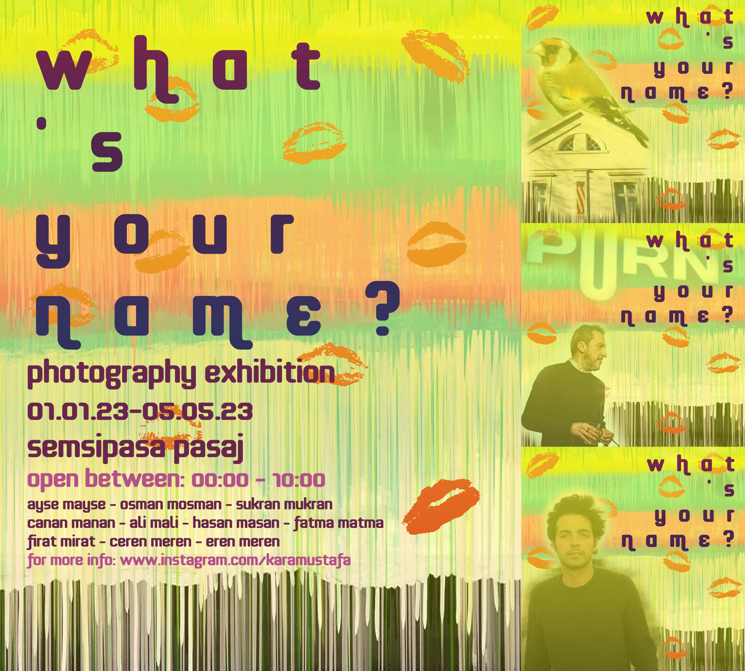
Similarly, for the photography event ‘What is Your Name’ in Istanbul, centered on queer life and the anonymity of the LGBTQ community, I devised a striking visual concept. The artwork featured lip marks on a colorful wall, symbolizing the anonymous existence. I meticulously crafted the poster and curated compelling social media posts to capture the essence of the event and engage the audience. Additionally, I ensured that each design element resonated with the event’s themes. The use of bold typography, vivid imagery, and thoughtful composition aimed to not only attract attention but also provoke thought and dialogue around the multifaceted experiences within the queer community.
Logo Designs

I’ve designed logos for Queer Shorts Vienna, where I developed a unique font to establish their identity steeped in inclusivity. The Bosphorus Jazz Collective in Istanbul inspired a logo capturing the essence of swing era decorations. For Slashed and More Slashed, a Bristol-based fashion company, I crafted a logo blending modern aesthetics with their innovative approach to design. Additionally, I’ve created logos for InnerCalm, a fictional wellbeing app promoting mindfulness, and SmartNest, a fictional home automation system embodying sleek, efficient design.

I approach each project with a focus on storytelling and brand ethos, ensuring that the design not only looks aesthetically pleasing but also communicates the essence of the brand. This involves thorough research into the brand’s values and target audience, allowing me to create logos that are both impactful and memorable. 
Posters

I specialize in creating evocative posters using Adobe Illustrator, where each design is meticulously crafted to reflect the essence of its production. 

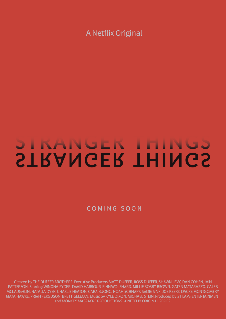
For the Netflix original series Stranger Things, I conceived a poster that plays on the show’s central theme of duality. The upright title subtly fades into the background, while its mirrored counterpart from the “Upside Down” universe stands out in full opacity. This design not only captures the eerie and mysterious tone of the series but also intrigues viewers with its visual storytelling.

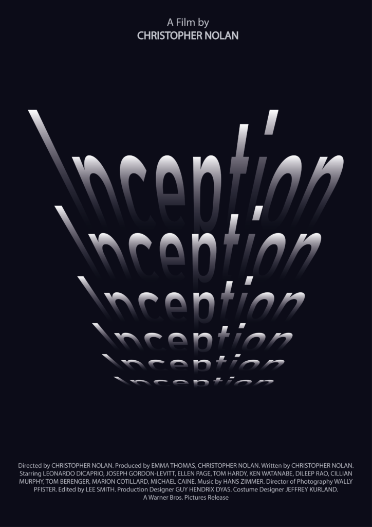
In my approach to the blockbuster movie Inception, I explored the film’s concept of layered realities. I created a poster where the title repeats itself, each iteration appearing deeper into the canvas, symbolizing the endless levels of dreams within dreams depicted in the movie. This design not only emphasizes the complexity of the narrative but also draws viewers into the film’s intricate plot.

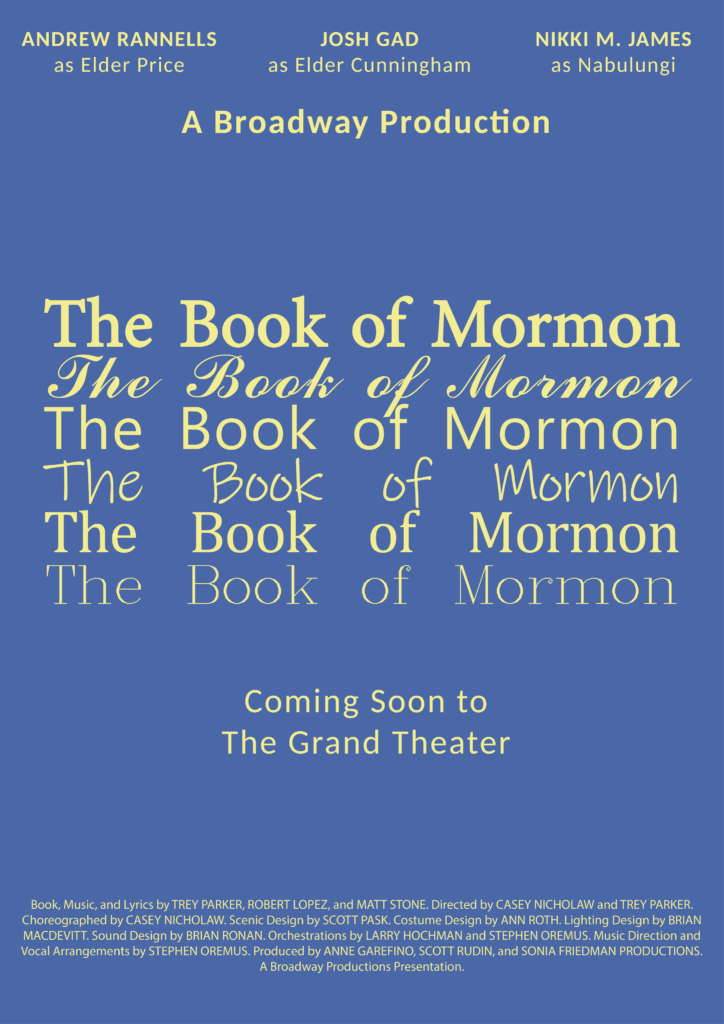
For the theatre play The Book of Mormon, I employed a creative typographical approach. I repeated the title in various fonts and styles across the poster, each iteration reflecting different aspects of the musical’s humor and cultural commentary. This design not only captures the playful spirit of the production but also invites viewers to explore the diverse themes and characters portrayed onstage.

Each of these posters showcases my expertise in Illustrator, blending technical proficiency with creative vision to produce visually striking and thematically resonant artworks.

Catalog Design

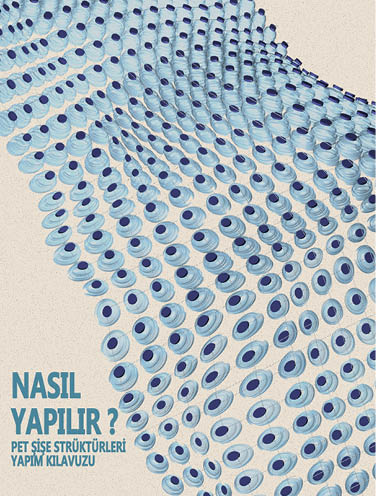
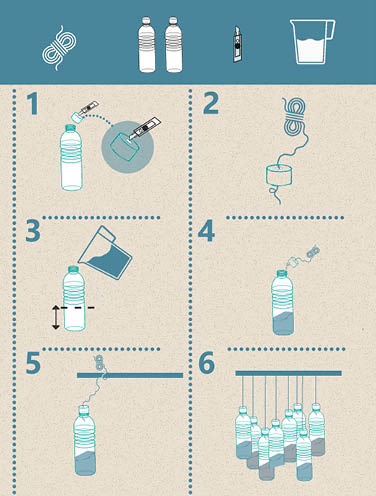
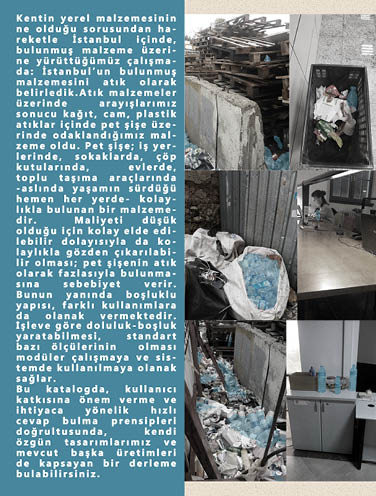
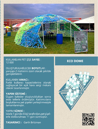
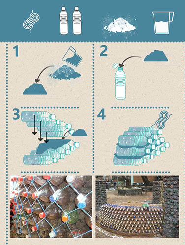
For a Master’s degree project, we designed a catalog that showcases several uses of empty water bottles as construction materials. The catalog showcased the steps clearly while informing the user about the excessive waste of plastic and examples too.

We included detailed illustrations and step-by-step instructions to ensure accessibility for a wide audience. Furthermore, the catalog featured real-world case studies to inspire innovative solutions to plastic waste.