Queer Shorts Vienna


About the design
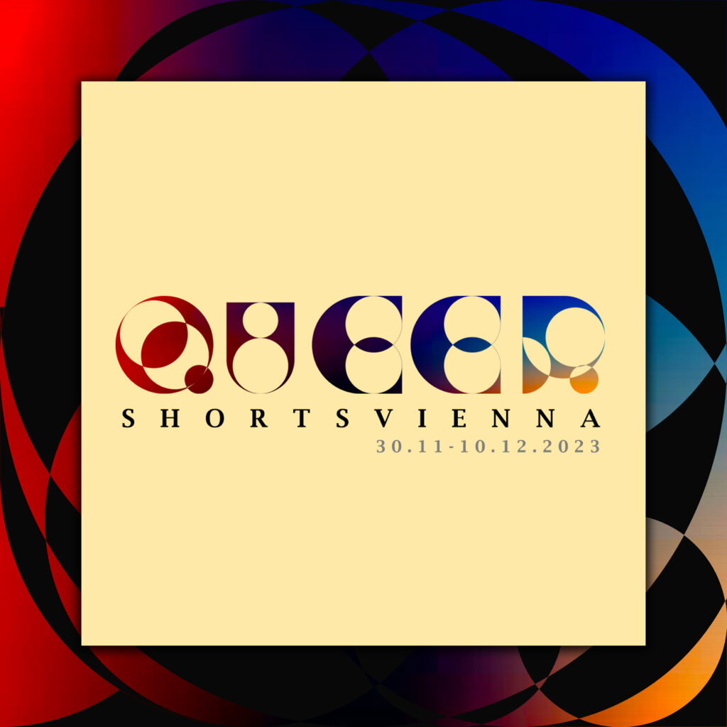
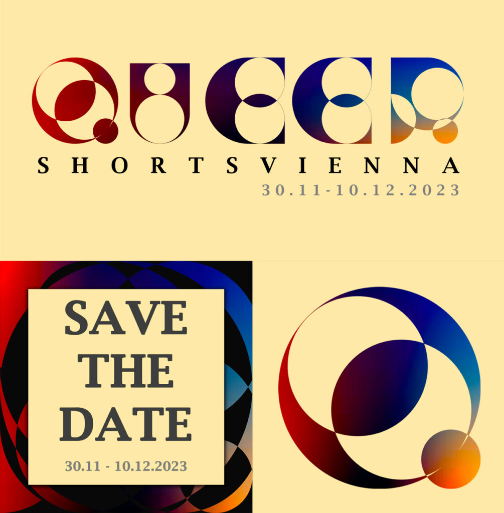
For Queer Shorts Vienna, I undertook a comprehensive design approach, starting with creating a bespoke font to establish their corporate identity. This font was meticulously designed to capture the essence of the event and was applied across various materials, including stickers, social media posts, posters, and banners. By ensuring consistency in typography, I aimed to create a recognizable and cohesive visual language that would resonate with the audience. The bespoke font served as the cornerstone of the event’s branding, unifying all promotional materials and enhancing the overall aesthetic appeal.
The design concept was deeply rooted in embodying the inclusivity and interconnectedness within the queer community. I emphasized overlapping shapes and vibrant colors to symbolize diversity and unity, which are central themes of Queer Shorts Vienna. Each design element was carefully crafted to reflect the event’s celebration of these values, ensuring that the visuals were not only eye-catching but also meaningful. Designing all their materials—from stickers and social media posts to posters and banners—allowed me to create a dynamic and inviting atmosphere, encouraging attendees to join in the celebration of queer culture and community.